Brand Readiness Hits the Road

The word branding sometimes conjures images of bucking broncos, rodeos where livestock are marked with an indelible sign. Indeed, branding with a hot iron speaks to the rambunctious nature of demands on a marketing department: we have deadlines to meet and lots of tasks to rope in. We want to brand our business with its own personality (perhaps even its own brand of humor), leaving customers with positive impressions. Working with other co-ops nationwide, we aim to brandish the cooperative advantage, communicating excitement about our business sector. How do we do all of this and keep ourselves in the saddle?
The good news: co-ops are poised advantageously regarding healthy foods and an emerging awareness of the positive effects of consumer democracy. While the rest of the world may only now be discovering the fact that customers are in fact complicated people driven by specific desires and messy lives, as well as by vision and values, we have known this from the start. Our member-owners created our stores, sit on our boards, vote in our elections, request goods and services, and make their voices known.
The challenge: despite being leaders in wellness and natural foods, research sponsored by the National Cooperative Grocers Association (NCGA) indicates that co-ops are often perceived as having an unsophisticated approach to marketing. The importance of developing our collective and individual brands has often been overlooked while boards and managers focus on building more tangible assets. Both nationwide and within individual stores, there is need for a shared marketing vocabulary.
“Communicating the value of a common branding strategy is definitely one of the most challenging aspects of a marketing manager’s job,” says Patricia Cumbie, editor of Mix, a bimonthly publication of Twin Cities Natural Foods Co-ops (TCNFC). Together with Katherine Roseth, NCGA marketing programs specialist, Cumbie is the author of the "Brand Readiness Kit," a resource designed to support brand development. Several co-ops in the Twin Cities metro area have made extensive use of this resource since its initial publication in 2003, and at CCMA 2004, the Brand Readiness Kit was the topic of a popular, thought-provoking panel.
Best font forward at Valley Natural Foods
The raw edges of random or outmoded design often reveal themselves in company logos, which require updating or more subtle adjustments over time. Many co-op logos were developed before the sophisticated software that today allows such significant symbols to be translated into various formats, helping bring unity to ads, letterhead, banners, newsletters, and store signs.
The story of “logo evolution” at Valley Natural Foods (VNF) is an exhibit in the Brand Readiness Kit. When VNF opened a new store in Burnsville, Minnesota four years ago, marketing and member services manager Charli Mills seized the opportunity to rethink the “look and feel” of its brand. Originally formed as Valley Community Co-op in 1977, VNF had as many as three different logos in circulation by 2001. It was time to retire and replace them, creating a new one to unify a fresh branding effort.
“I learned about the importance of fonts, color, and visual design elements by looking at Lakewinds Natural Foods in Lake Minnetonka,”
Mills explains. “Katherine Roseth was marketing communications director there at the time, and she used the Lakewinds ‘swoop’ (which looks like a wave on a lake) to redesign signage.” Roseth and Mills continue to work together at monthly meetings of the Twin Cities Natural Foods Co-ops marketing group, a peer support network where resources are developed and ideas shared.
Mills assembled a new font package around a distinctive typeface that interior designers had selected for the “trail signs” marking the new VNF store aisles. She made the decision to be consistent with the use of these fonts, even printing the logo on employee paychecks. Everything from the unobtrusive “shoes and shirt required” sign on the front door to local print ads had to meet the brand standard. VNF fonts were also used in promotional signage, such as the Savor the Seasons promotions developed by Chris Ryding.
“We had a designer reconfigure the Savor the Seasons holiday images, printing them horizontally on vinyl to fit an area above our meat case,” says Mills. “This turned out to be a good example of how you can take a regional or national program and adapt it to support your own look. Once you have a clear sense of the national marketing strategies, as well as a respect for the value of your own brand, you can make subtle adjustments to the enhancement of both.”
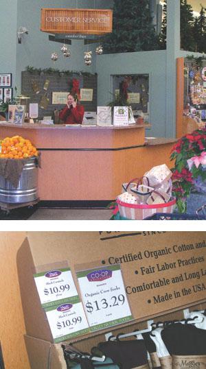
In the store, eliminating visual clutter may make it easier for customers to appreciate some of the other design features of Valley Natural Foods. High ceilings with appealing seasonal platform displays draw the eye upwards: a child’s wooden barn surrounded by pine trees reinforces the concept of a walk through the countryside on nature “trails.” In the deli seating area, a fireplace made with smooth river stones adds warmth, and accordion doors open to create a large community room.
All of these architectural elements combine to enhance the experience of shopping at Valley Natural Foods: a specific mix of symbols and attributes unique to the store.
Linden Hills looks ahead to a natural home store
Another member of the TCNFC marketing group is Jeanne Lakso, marketing and member services manager of Linden Hills Co-op. In 2003 Lakso began a conscious rebranding effort, with the support of general manager Paula Gilbertson. “By the time we began our branding project, we had already established a training program for staff that included classes in cooperatives, natural foods, and customer service orientation,” Lakso explains.
“We were conducting two member recruitment drives a year and annual customer surveys. Regular store audits were part of our routine, making sure we were up to par on cleanliness, in-stock merchandise, attractive displays, and other benchmarks for daily success. All management team members participated in monthly team meetings and an annual daylong planning session to develop goals and action plans for the coming year.”
Linden Hills, in other words, was ready to hit the ground running. There was a healthy employee culture and an awareness of the need to involve everyone in the creation and maintenance of a successful brand.
“The Brand Readiness Kit provided us with an invaluable template as we began to articulate how we want to be perceived by our customers. The branding process coincided with a yearlong store remodel, so the timing was right to make changes.”
Lakso brought in Pat Thompson, Creative Director for Triangle Park Creative, who had made a successful template for The Rolling Oats Journal, the Linden Hills bimonthly newsletter. “We knew that a few things were not going to change: the newsletter, the ceiling, and the floor tiles,” Lakso recalls. The co-op had also developed an edgy “Wheatboy” T-shirt, with the slogan “Cooperate, and no one gets hurt.”
“We had a situation where one good thing just led to another. A clean, attractive, and appealing newsletter set the tone for other design elements, including a customer service brochure. New signs picked up on the colors of the floor tiles. With each project, we made connections to the last, following through on various concepts. Our customers live in a sophisticated urban market, and they’ve responded enthusiastically to what we like to see as our friendly aesthetic, marked by a hint of nostalgia and wit.”
Linden Hills Co-op has just embarked on a new venture, Linden Hills Natural Home, scheduled to open this spring in an old house across the street from its current location. “Having established a visual language and a brand standards manual (see sidebar, page 19), we’ve been able to move forward much more quickly on designing the new space and preparing signage and advertising,” Lakso notes. “The time we invested in educating ourselves about branding was definitely well spent.”
Public relations savvy at the Wedge
Valley Natural Foods aims to “own its neighborhood,” using direct mail to reach out to midlevel suburban customers living along the edge of the metropolitan ring, introducing many of them to a co-op for the first time.
Wedge Co-op, on the other hand, is literally owned by its neighbors, who live near the Minneapolis core, close to the commercial district and wedged within neighborhoods filled with large older homes, modern high rises, and classic Midwestern brick apartments.
Recognized by Mpls-St. Paul magazine as “a national force in food and food values,” Wedge Co-op is lauded for having “exceptional customer service, an incredible bakery,” and several departments that were the first in the country to be certified organic. Its reputation as “the crowning achievement of a local co-op movement” is built on a commitment to providing reliable food information. Successful financial management ensures that patronage rebates (over $500,000 in 2004) are mailed just before the holidays each year (replacing the notion of “discount days”), and membership stands at 11,000 and growing.
The Wedge has no marketing manager; member services are its most apparent “brand.” One of its strongest assets is public relations preparedness with respect to food safety issues. Member services manager Elizabeth Archerd knows how to stay on message: “The co-op is guarding the integrity of your food,” she insists. “We will always tell you what we know, and we will always talk to reporters.” This position has earned them a reputation as reliable and relevant food experts.
Essential strategies, essential oils
“Sometimes people are afraid that branding will put you into a rigid space where you can’t be creative, but that isn’t the case,” notes Mills of Valley Natural Foods, reflecting on the value of the Brand Readiness Kit. “Branding just gives you boundaries, and boundaries are a healthy thing. They force you to identify your best practices and create your best symbols.”
“The Twin Cities Natural Food Co-ops marketing group has made such a difference to the success of our efforts,” Mills observes. “We’ve been able to bring individual strengths and experiences into one space, learning how to collaborate successfully without sacrificing our particular identities. It’s like working with essential oils—individually each one has specific qualities. But combined, they achieve a synergistic effect.”
Since the creation of the Brand Readiness Kit, the TCNFC marketing group has empowered itself to create a budget, using some of those funds as a test market for NCGA-developed print ads. Katherine Roseth is currently putting the finishing touches on those ads, dividing her time between supporting the Twin Cities co-ops and NCGA.
“All of our boats will rise if we get behind the idea of a national co-op brand,” observes Roseth. “It’s time. 2005 is the year that member stores can look for the launch of some of the national programs Robynn Shrader has been developing as marketing director for NCGA. The more stores who choose to participate in these programs, the stronger our efforts will be. Our goal is to send a unified message out to the community, one that will appeal to customers, enhance our reputation, and strengthen food co-ops everywhere.”
The Two-Page Brand Standards Memo: Linden Hills Co-op
Having a great store brand is a lot like having a beautifully clean house: unless you’re willing to do constant maintenance, it’ll soon become nothing more than a fond memory. That’s why you need a brand standards manual.
Through sophisticated and costly industrial espionage, I was able to look at a brand standards manual from a national natural foods chain. It weighed in at approximately eight pounds and included sections and rules for usage on the stores’ color palette, official fonts, logo, store signage and informational brochures, external and internal communications, web site, and lots more. The brand manager at this chain has a big job, ensuring a consistent customer experience on not just one but two continents.
At Linden Hills Co-op, we have more of a brand standards memo—it’s just one double-sided page. If we continue with the clean house metaphor, the super-natural’s manual is a commercial carpet cleaner: it does a really great job, but you need a van and trained professionals to use it. Ours is more like a carpet sweeper: it’ll keep things looking pretty good if you use it regularly; it’s also very portable and requires no special training to use.
It’s tempting to just sit back and admire your handiwork after establishing your brand, but unless you’re willing to watch your carefully crafted vision slowly erode, you’ll want to document it and engage your store staff in maintaining it. That’s where the brand standards manual comes in handy.
Our manual includes lists and examples of store fonts and colors for signage, our customer service vision and standards, Ends Policies, and key messages we want to convey in public relations, advertising, and external communications. It also shows how to use our store logo correctly.
My goal was to create a helpful checklist for all store staff, but primarily for sign makers. Since I am already responsible for our newsletter, advertising, educational handouts, and membership materials, this was the only branding component not directly under my control.
Thanks to my general manager, I received the honorary title of “Sign Czar,” and am empowered to remove any store signage not in compliance with our brand standards. This sounds more exciting and severe than it is, as the staff has come to see the beauty and advantages of our branding efforts. This little carpet sweeper really works!
—Jeanne Lakso, marketing and member services manager
The Brand Readiness Kit
The Brand Readiness Kit contains advice about creating a marketing plan, a marketing budget, and customer surveys. It offers step-by-step advice for implementing brand identity efforts, including newsletters, press kits, websites, and ads. It explores the natural link between member services and marketing, while defining a successful customer service culture. “I cannot possibly give it enough praise,” says Alex Beeby, marketing and member services manager of Just Food Co-op in Northfield, Minnesota. Alex is using the kit to establish brand standards at that new store (see story, p. 6).
Copies of this resource are available from:
Triangle Park Creative, c/o Stacey Holland
Phone: 612.692.8560x210
Stacey@tripark.org
As of February 2005, the price to NCGA members is $20 per copy; $35 to nonmembers. The Brand Readiness Kit is invoiced through NCGA; shipping and handling fees are extra.
***
Ellen Michel is director of marketing and communications at Bloomingfoods Cooperative in Bloomington, Indiana (marketing@bloomingfoods.coop).


